Understandably enough when many people start thinking about making something they tend to think results. It is natural enough. You need to know what the thing looks like before you can build it. But is that really wise? Actually no.
Bridges all tend to look different. Some have lots of rigging in pretty “sail” patterns above the road, some have none. Is that all just fru fru? Do you decide to build a certain style of bridge then glue it to the river banks? No & no.
A bridge gets built the way it is to suit the purpose of the hole it crosses. Sometimes people want it to be more gold or bluestone, but shape really comes more from the engineering & financial challenges than anything else. If it solves the problems elegantly then the bridge will look and feel elegant.
Having a website, piece of music, or logo built for you is exactly the same. If you want it to appear elegant, to work well for its intended purpose, you need to start with what the needs & challenges are.
She Told Me So
Being me, I will start with what you don’t want to do. It may not be the Hipster way because its not Avocado positive, but if you don’t know what the hole looks like you might just fall into the darned thing.
Unless you want to spend a lot of time, money, and frustration, don’t do el-cheapo clones of what someone else did and hope it works out: if it were a bridge a poor design brief might well go something like:
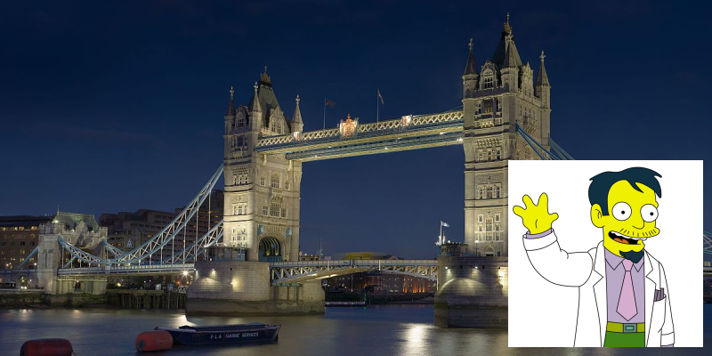
I need a bridge from Australia to Japan so I can bring over Japanese spec Camrys. I like the look of London Bridge. (actually that’s the Tower Bridge)
expecting that you will get a bridge that looks just like this one, only from your house in Sydney to just outside the Toyota Plant in Japan so you can drive them shiny new Camrys over to make a killin’ in the Trading Post classifieds on the weekend. (oh its all so very 4-hour work weak)
Good luck with that.
One Foot In Front Of The Other
In reality, the best way to build a thing is to step back before you make any drawings or post adverts on Upwork; get someone in to ask you the really core questions:
- What is really needed here?
- For who?
- Why?
You may be surprised at the answers. Now I will say that this process isn’t always comfortable, it often seems like you are going in the wrong direction and thinking about things that aren’t your shiny new success. Many businesses set themselves up for failure right at this point as they skip this process either entirely or by giving shallow answers to the questions. Common answers that are a sign of missing the point are:
- What is really needed here? my object
- For who? everyone from 8 to 80
- Why? because my object is great
Ummm
Let’s look at a Case study of a Logo I recently made for a lady with fair bit of experience in business.
Rubies Biscuits – a Case Study
I already knew “Rubie” (not her real name) – not for long but we just kinda clicked straight away. Our values are pretty similar. This is important because if you try to do amazing work with people whose values are different from yours, it is hard as you don’t share a common set of goals & expectations (call that language).
The logo project started as we were sitting chatting whilst our kids did their thing. Rubie, talked about some biscuits she was making. She had me at biscuits. Once I realized that this was a serious thing for her I started paying attention. My first question was:
I can run down the supermarket and pick up a packet of 12 choc-mint slice biscuits for $1.65 so why would anyone buy your biscuits?
Rubie’s response was fairly typical, “because mine are better”. I was losing interest in a hurry I can tell you. Until she pulled out her phone and showed me some photos of these biscuits. They are big, animal shaped, and covered in bright character drawings. Doesn’t sound like much in itself but the biscuits had real character. Once I established that these were hand-drawn and not stencils, I was back in the game for round two.
Talk turned to a logo (I had been trying to work on a logo for a shared friend) and so my questions really became a lot more focused. This is where most people make that fatal mistake of not wanting to step outside the obvious. They try to end the conversation or give cliche answers. I don’t recall all the questions I asked but they were all aimed at getting a clear overview of the three core questions above.
Lift Off
Rubie has a background in events so while the biscuits could be retailed in a small shop or market stall, the real market seems to be in uniqueness. Each biscuit is hand iced so no two will be exactly the same. This makes them attractive to people for weddings and the like, where they want everything to be an Event.
It wasn’t hard to work out that this wasn’t selling biscuits at all. Rubie can’t beat that supermarket equation so her product has to be be about something more to make people motivated enough to choose her biscuits for their event instead of the cheap (but oh sooo yummmmmmy) ones.
What Rubie is really selling is not biscuits but a set of feelings (wrapped in biscuit). Once we established that, we talked about the sorts of people who were likely to buy and what they want from this transaction. This even ranged out to discussion about breakage ratios during delivery & pre-event and how to resolve that in-advance.
That narrowed us down to certain types of people who want to buy certain types of feelings. From these feelings I set off to make a Logo that represented not biscuits but those feelings.
You don’t dictate the outcomes, you dictate the values and let the specialists let their innate magical powers (or skills) work out what the right expression is.
During the discussion I had an image in mind. While I am not technically a Graphic Artist, I was trained in Logo Design when I worked in a Graphic Design house. I had my initial visual idea based on how those feeling expressed themselves in me. I also know that I am not really Rubie’s target audience.
Unchained Melody
Good logo design is done as an iterative process. That means that where you start on-paper will not necessarily look anything like where you end up. To get to the right outcome, you must have a good vision based on the important things – which is what the logo needs to say instead of how it will look.
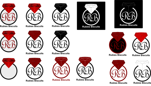
My first round of logos were attempts to get close to the image I saw as a starting point and then to explore other possibilities that come from each thought. This is what the first round of designs looked like:
The process is actually a lot like riffing on a musical idea. Each thing you do lets you try another idea. Some ideas are close to the one before, others are a fair leap. The important thing though is to keep to the core vision which was about Uniqueness, Luxury, Good Memories, Togetherness, Family.
Rubie liked the ideas with the circles best. We both knew we didn’t have a winner yet – except for that big ruby. There was a request to look at a script font for the “RB”. I took what we had and sat down for a few more hours to sketch out more iterative ideas:
I never work to exactly what the client says in technical or littoral terms so you see that my ideas bounce around a little. Some service providers and clients will get irate at this idea – like I’m making it about me instead of them. Not so. I’m being loyal to the ideal of the job at hand. In music terms that is honoring the Song and letting it develop into the Power Ballad (with hit potential) it wants to be instead of forcing it into being Metalcore (with no magic are sale-ability). I drop clients who can’t appreciate this as we don’t share values.
Just as I was sending these off I had a brain flash. I should have seen it before but…
What if the Ruby sat on top of the circle? It would make a Ring! That makes it look very much in keeping with the core ideals of what buying these biscuits is about. With the letters side by side they become less Regal-unapproachable and more Intertwined which better matches the Family & Togetherness aspects. Instead of a diamond, the Ruby is much warmer and being red makes it very vibrant.
Rubie loved that instantly. We both knew we had the expression of what Rubies Biscuits were really about.
We went through a couple more rounds to finesse colors & spellings to get them saying exactly what we needed them to say and I was nearly done.
Nearly because there is more to making a logo than just a picture. A logo is not the brand but it represents the brand’s values. it encapsulates them. This means that the keywords need to be understood so that anything else that they brand does has to be referenced to those core values before it is considered a good fit for the brand.
Let’s Face The Music (and Dance)
Ferrari can get away with making cheap caps with their logo on as it is about the aspiration parts of the brand, but if they try making cheap cars that compete with those Camrys that lady is driving back to Sydney over her Tower Bridge then the whole Ferrari thing quickly comes crashing down.
This is thing where a lot of people go very wrong in business and then wonder why even if there was an initial win, the business spirals down the gurgler. If you have a clear idea of what your brand really does, then you can see if your plans fit or conflict with the ideals. If they aren’t a solid fit then abandon those ideas as quickly as you can. Change your plans but never your values.

The discussions you have when starting your project are always the same. You don’t dictate the outcomes, you dictate the values and let the specialists let their innate magical powers (or skills) work out what the right expression is. It may surprise you BUT do you care if the thing you sell is pink or green? No you only care if it sells, not just today, but tomorrow and the year after, because your customers are really delighted with how you made their lives better in that way that only you can.
In practical terms this means that I made a Brand Document that outlined the Keywords and Vision of the brand along with Color Codes, Font Names and a set of rules about how the logo should be used so that it doesn’t get broken up as soon as it hits a technical hurdle in printing or page color. To be in-control of this I also made a set of alternates that would cover just about any scenario that Rubie might meet with logo usage.
Now, where’s my biscuits?
